n     <- 10
data <- read.csv("../../../datasets/Album Sales.csv")[, -4]
data <- data[1:n, ] # take the first 10 rows of the album sales data set from Field
DT::datatable(data, rownames = FALSE, options = list(searching = FALSE, scrollY = 415, paging = F, info = F))5. JASP: Visualization and Correlation
2025-09-10
Why JASP?
- User-friendly, intuitive interface
- Open-source (free)
- Reproducible analyses (easy to share)
- Better than IBM’s SPSS for transparency and workflow
- Integrates with R for advanced users
![]()
Getting Started with JASP
- Download from jasp-stats.org
- Open JASP, load your dataset (.jasp, .csv, .sav, etc.)
- Familiarize with the interface: Data view, Input panel, Output panel
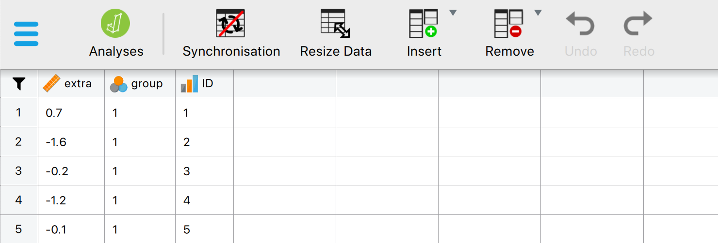
Loading Data in JASP
- Click Open > select your file
- Data appears in spreadsheet view
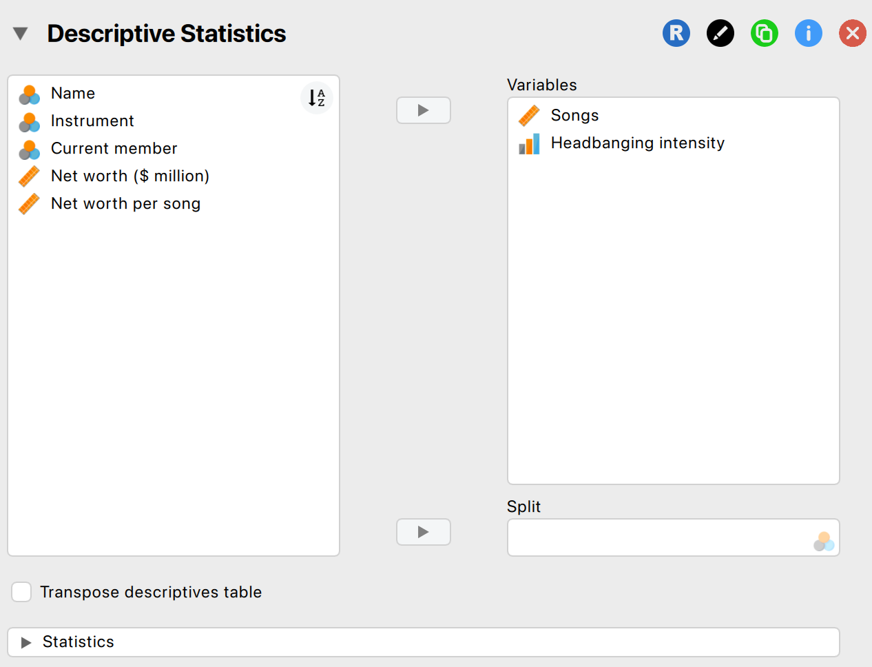
Descriptive Statistics in JASP
- Go to Descriptives > select variables
- Options: mean, median, SD, min, max, quartiles
- Output updates instantly
Getting help
- JASP Video Library
- The book
![]()
Data visualization
Why Visualize Data?
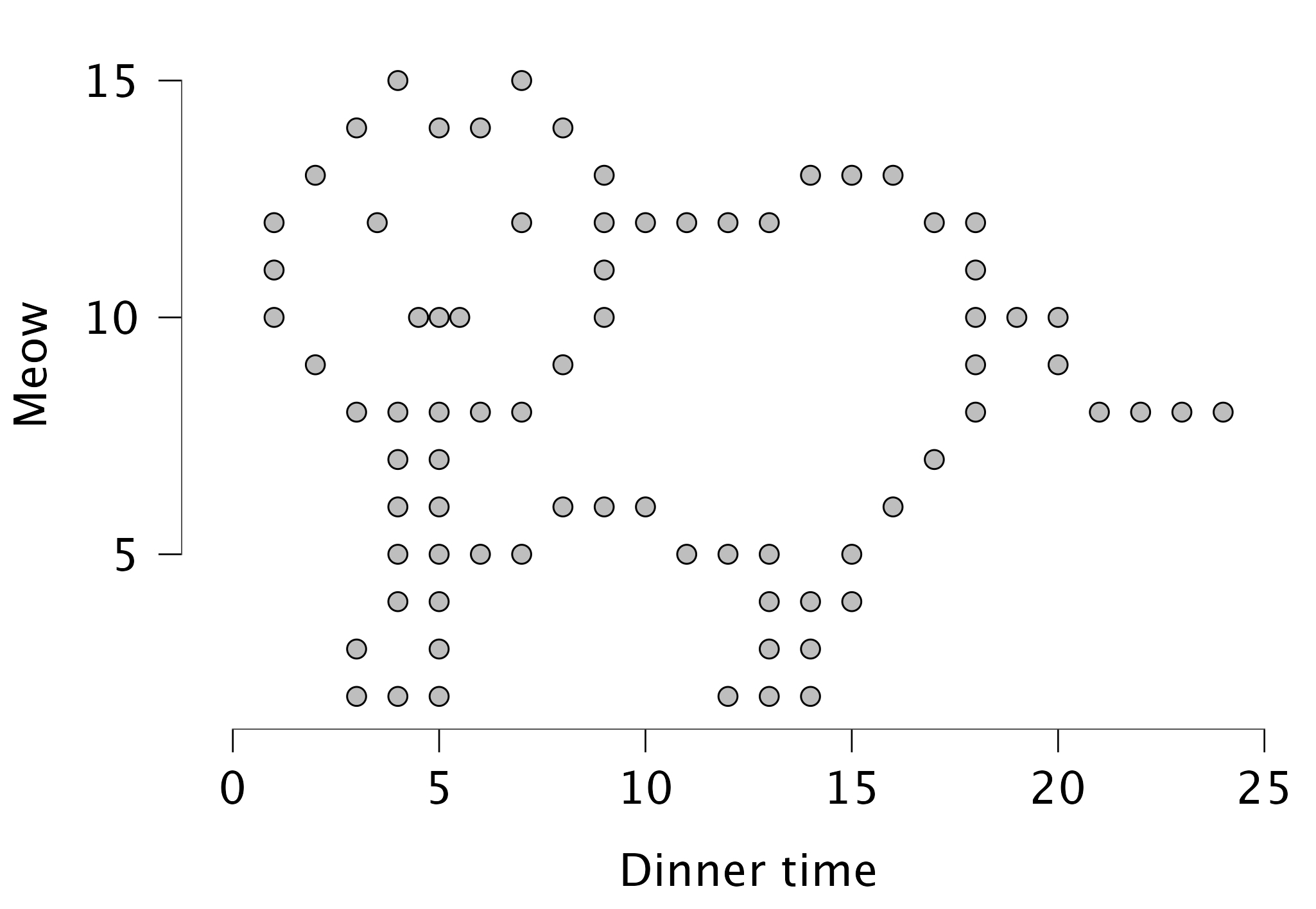
Figure 5.15 Catterplot
Boxplots: Visualizing Spread and Outliers
- Shows median, quartiles, and outliers
- Useful for comparing groups
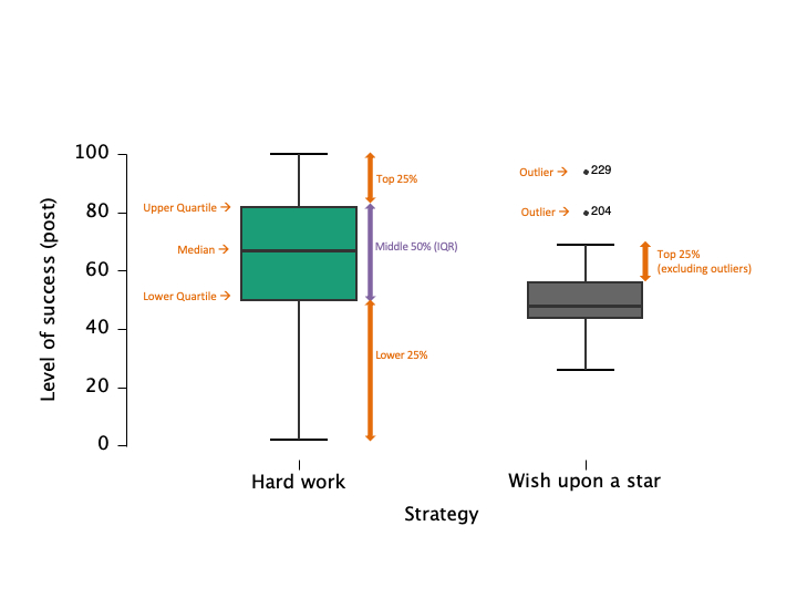
Figure 5.9 Boxplots
Raincloud plots: Boxplots + Raw Data
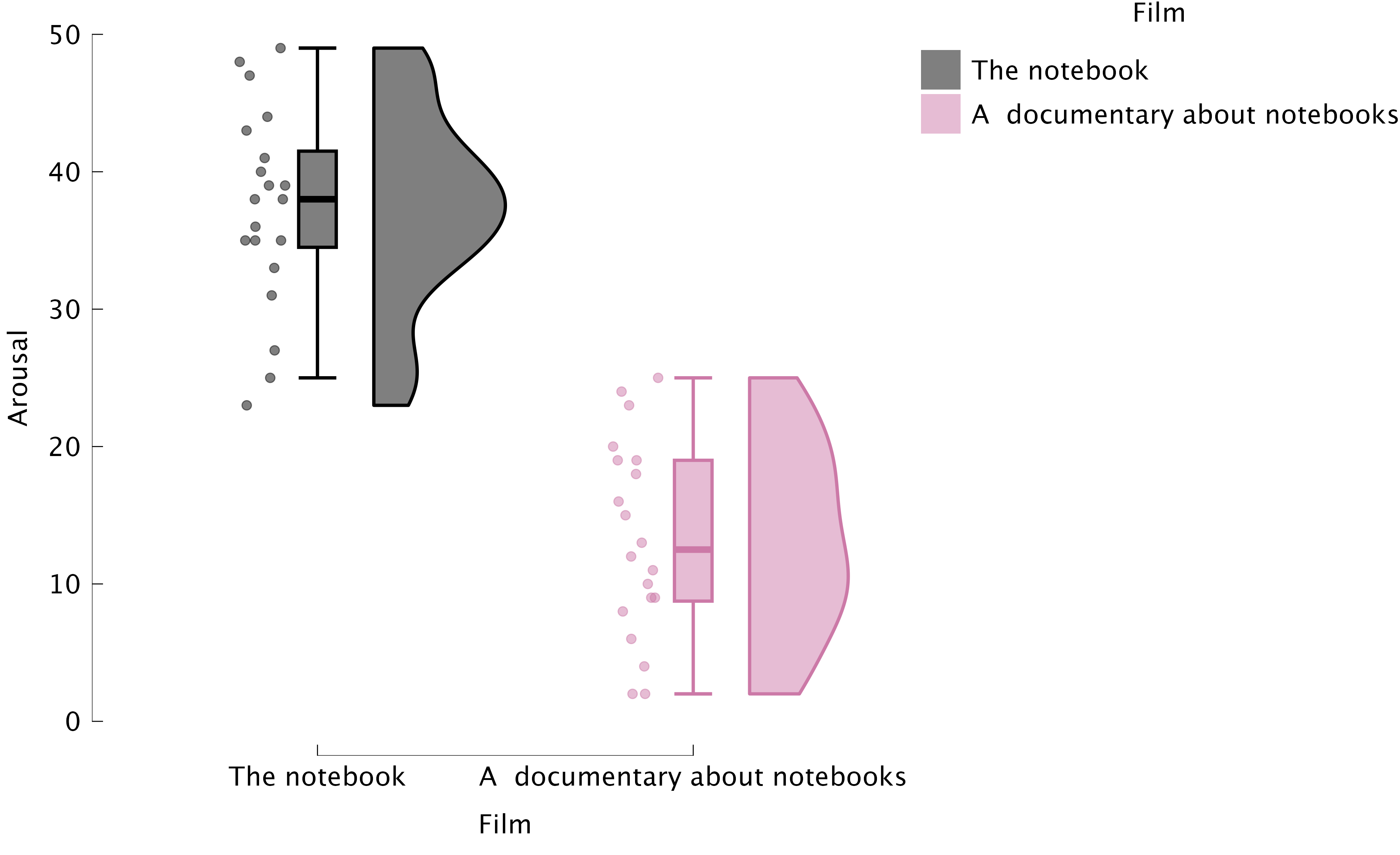
Figure 5.11 Raincloud plots
Critically Assess Graphs

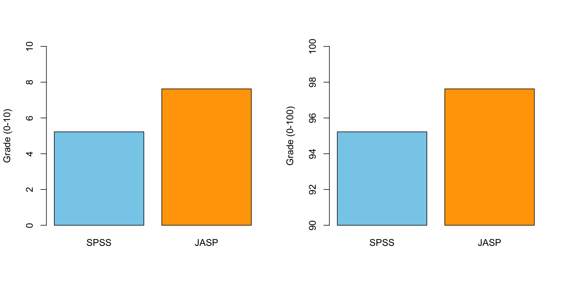
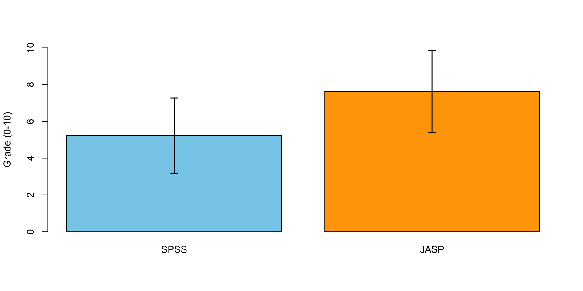
Scale Matters
Error Bars!
Pearson Correlation

In statistics, the Pearson correlation coefficient, also referred to as the Pearson’s r, Pearson product-moment correlation coefficient (PPMCC) or bivariate correlation, is a measure of the linear correlation between two variables X and Y. It has a value between +1 and −1, where 1 is total positive linear correlation, 0 is no linear correlation, and −1 is total negative linear correlation. It is widely used in the sciences. It was developed by Karl Pearson from a related idea introduced by Francis Galton in the 1880s.
Source: Wikipedia
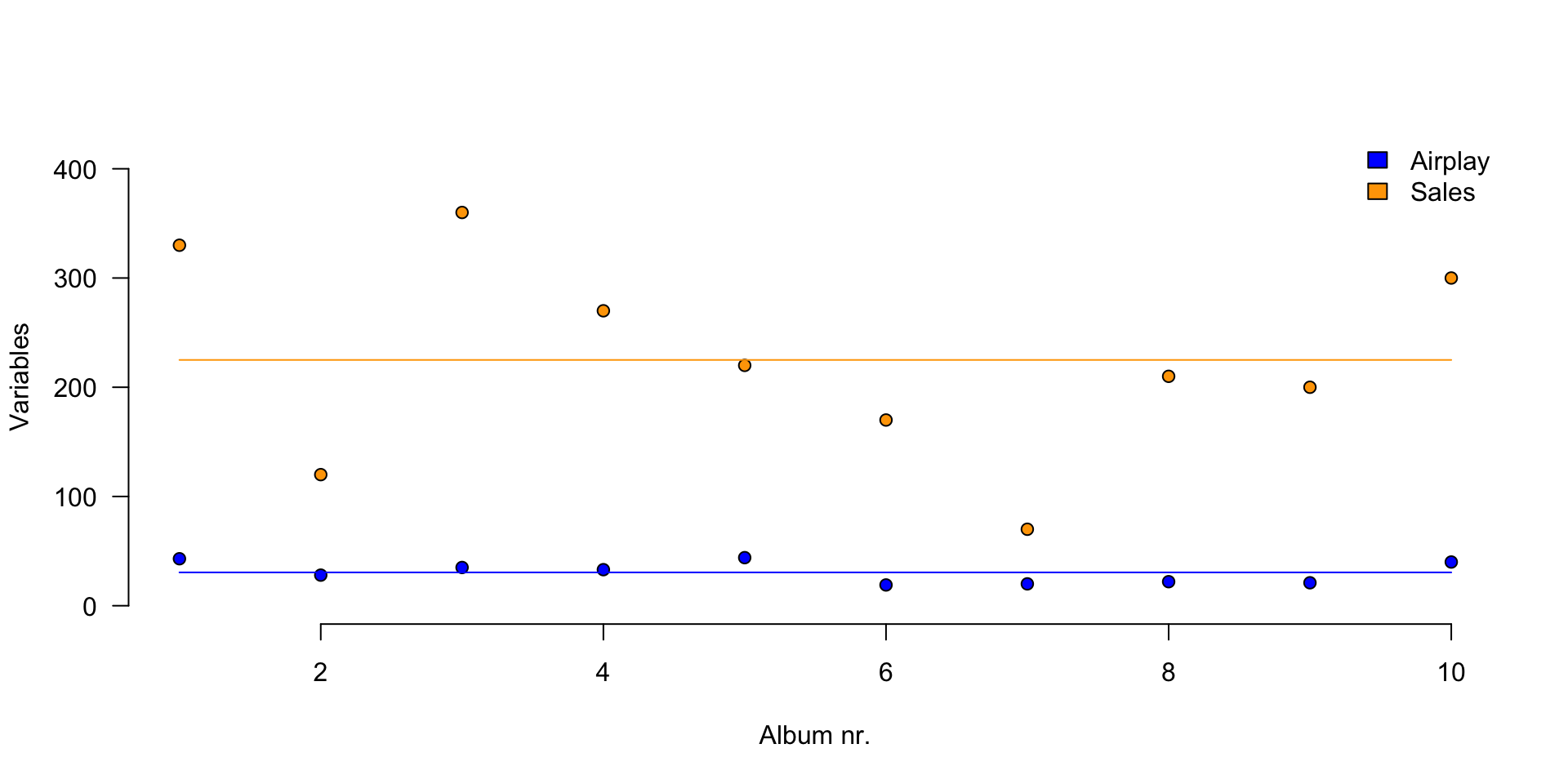
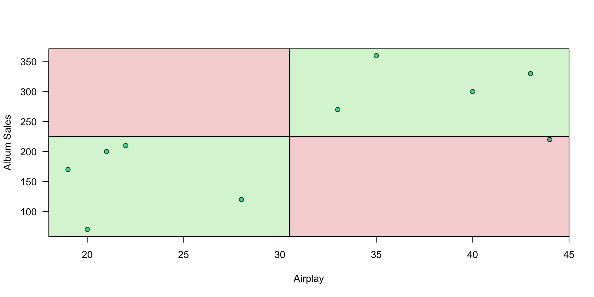
Plot correlation
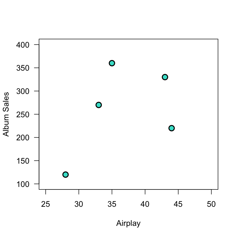
Plot correlation
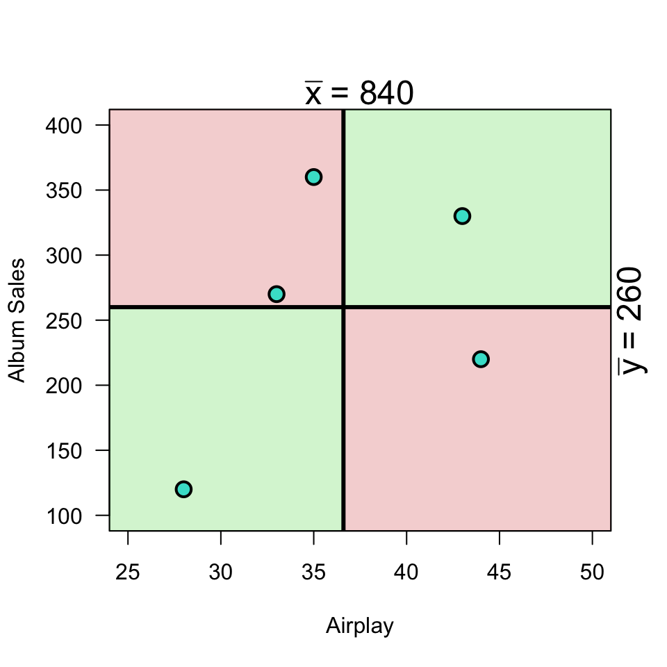
Plot correlation
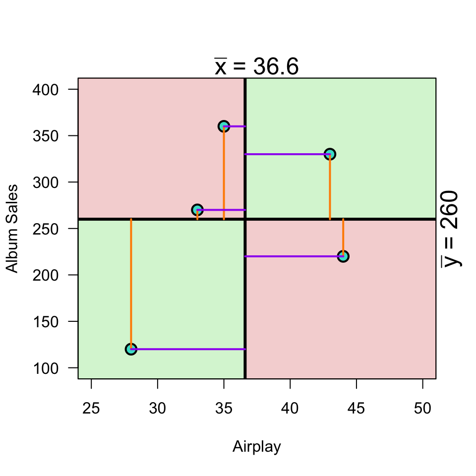
\[(x_i - \bar{x})(y_i - \bar{y})\]
Variance
Standardize
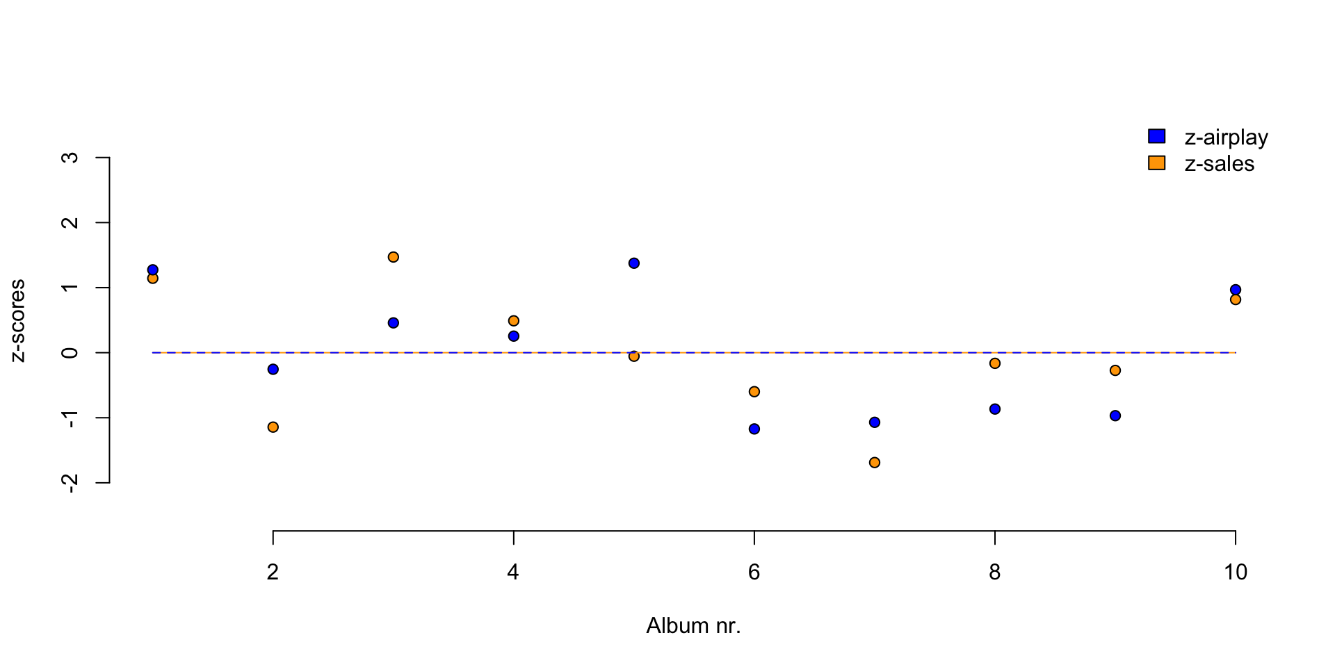
Standardize
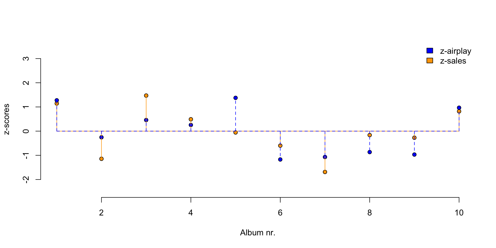
Plot correlation
Visualize
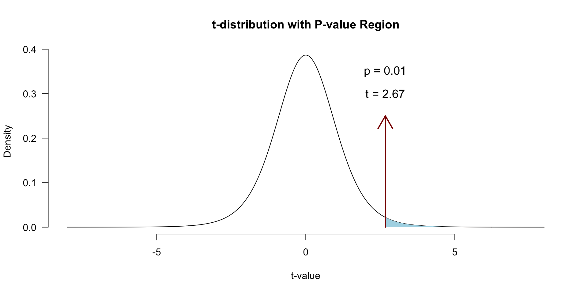
Locate in \(t\)-distribution
Contact

![]()